The Gokhale Method: website makeover
Scope
2017
Team
Alissa Rubin
Justin Moore
Key Skills
research
Wireframing
Usability testing
Content Strategy
A site with a slouch
When I arrived at the Gokhale Method (see an overview of my role here), the website was a Frankenstein of different front-end styles and back-end tools. There were many opportunities for improvement, both with the visual design and with usability.
I was given freedom to recommend design changes, but had to be scrappy in the design process.
Advocating for Design
Although given the design go-ahead from the CEO, resources were tight. Without any history of design processes at the company, but with enthusiasm across the org, I had to be inventive about accomplishing research, prototyping, and implementation!
In speaking to other employees about my goals for the site, I unearthed a champion in my court: another employee, named Justin, who was familiar with the back-end of the site, able to code simple page designs, and was excited about improving usability and design. Together we were able to prioritize fixes based on the design goals as well as the ability to build out the necessary changes to the site; to wireframe and code design prototypes for usability testing; and to implement them on the website.
We were able to prioritize projects, build prototypes for testing, and implement changes on the website.
Design Strategy
My first step was to define the design direction for site changes. I wanted to strategically lay a foundation for a future complete redesign, if that became a possibility. It was also important that updates mesh with the existing site as much as possible, while elevating the look and feel. And on top of all this, designs changes had to be within Justin’s technical capabilities and available time.
My roadmap for identifying and prioritizing necessary design changes included:
refining existing brand values into a style guide
creating existing site map
reimagining the IA, creating an ideal future version of the site map
using existing customer research, Google analytics, company knowledge to identify key site tasks
developing task-based user personas
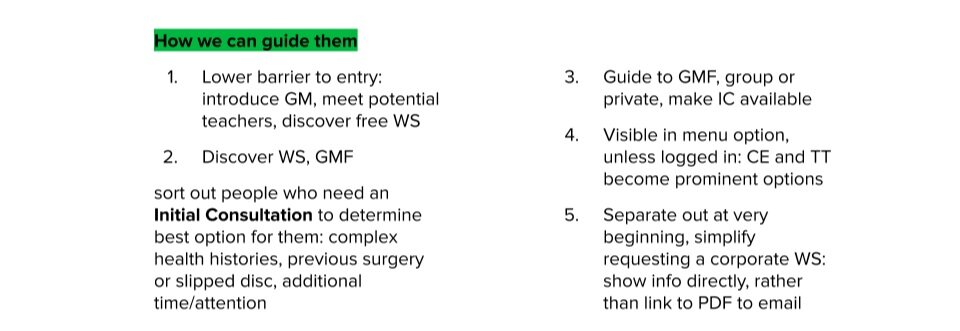
defining content needed to guide personas to goal
mapping primary task flows for each persona
Research, from scratch
—
With little established customer research, the best source of information was the organizational knowledge from employees and teachers who had been interacting directly with Gokhale Method students and customers for years. I interviewed employees and teachers to learn about our customers’ behaviors, mindset, concerns, and stories. To this I added my own interactions with customers, from fulfillment and CS, to build out a body of qualitative knowledge. In addition, I was able to access resources like Google Analytics to understand quantitative behaviors and demographics of our site visitors, and could sometimes survey posture students as they came and went through the office.
—
In addition to developing user personas, I mapped behavioral/need archetypes of website visitors. This clarified different user journeys, highlighted the most critical pages and task flows, and identified where the information architecture of the site was helping or impeding users.


I developed archetypes by starting with the question, “who is coming to the website and why?” The tasks they engaged in were indicative of their needs and goals.
A unique design process
—
Once Justin and I aligned on the next page or feature that required a redesign, I brainstormed and sketched designs based on our insights so far, then took them to other employees for feedback. After refining the top ideas, I built wireframes or rough mock-ups in Sketch, then took them to Justin to code a basic version of.
One unique aspect of this process was that Justin and I did about half of our iterating and prototyping on coded versions of the wireframes. Because Justin was not a front-end developer, rather than designing a pixel-perfect UI mockup to pass off to him that he might not be able to execute the way I had designed it, he would start by coding a wireframe of the design to make sure the layout could be made responsively on the front-end, and could connect to our system on the back-end. We would then usability test these prototypes, iterating the layout, flows, and visuals repeatedly, with increasing functionality in the code and visual fidelity. Once we were pleased with the performance of the new design, Justin would work on getting the updates implemented.
Pen and paper are my preferred way of quickly brainstorming design and content ideas, exploring layout options and seeing how the user’s journey will move from one point to another. In my own design process, planning content and UX/UI together is essential; it is impossible to properly design a layout without knowing how much and what kind of content will populate it. It turn, the content required to effectively guide a user on a journey depends on the format of the path the user will take.
Standing a little straighter: outcomes
—
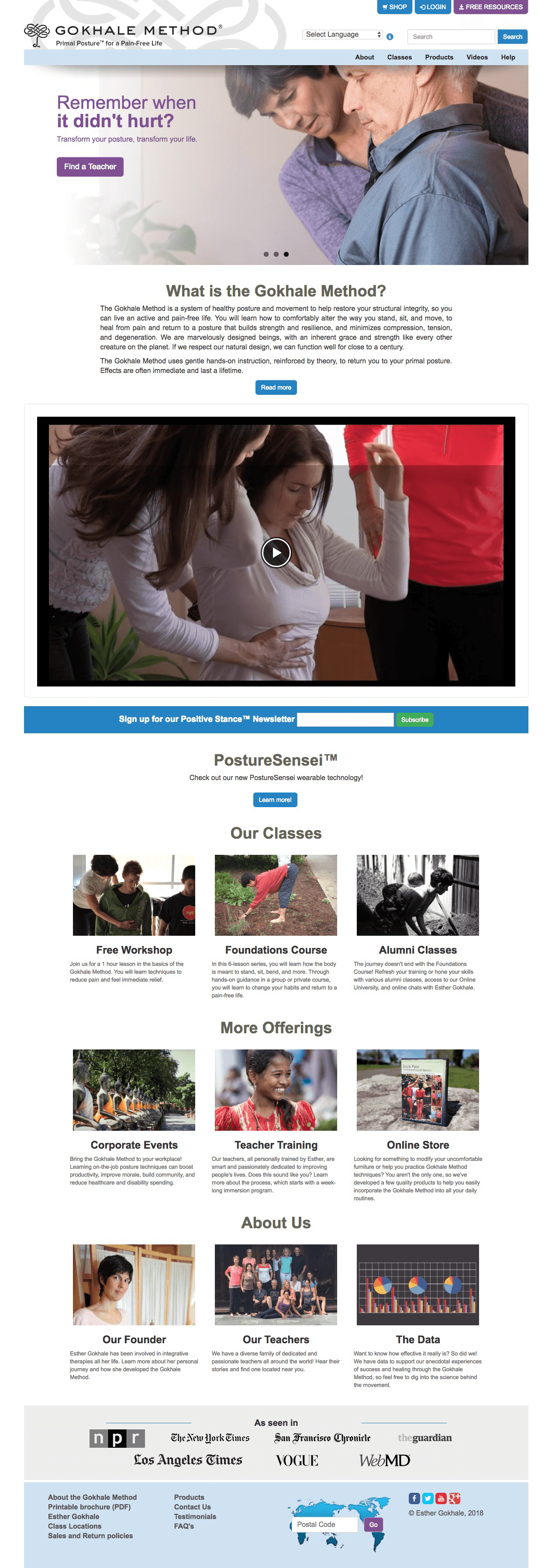
Design changes on the home page focused on these goals:
Clarify what the company is selling and why the visitor should care
This led to the addition of the intro paragraph and ‘about’ video
Provide guidance by creating hierarchy, simplifying and grouping visitor choices
We reorganized the page into categories consistent with our visitors’ mental models as well as similar websites, improving information findability with clear titles and short descriptions
Provide clear and consistent CTAs, so visitors aren’t left unsure of how to proceed
Frequent, visually prominent CTA buttons tell you exactly what you can expect to find, and encourage forward progress
Update the look and feel of the UI/visuals, bringing it more in-line with brand identity, especially simplicity and clarity
We limited the use of color to apply it as a strategic call-out, and replaced images to take advantage of high-quality field research photography Esther had taken over the years
Empower visitors to stay engaged with their journey through content, company news, scientific research updates
Including the newsletter sign-up, showcasing the new wearable device, and linking to the company’s post on research data were key ways to empower visitors with information and the ability to remain updated and engaged
Desktop class info page
—
Design changes on the class info pages were centered around:
Listing event details in a more digestible way
The old design was essentially unformatted data pulled from the backend; we changed it to read in a more natural format, and used hierarchy to break up information into digestible single-column views of “event” and “venue” details, using icons rather than titles when necessary
Increasing visibility of key information
The map size was reduced to allow more event details at the top of the page, and text colors were simplified to remove the appearance of links and remain consistent with new UI patterns; teacher information was placed on the same page to keep visitors from having to click away and navigate back again
Placing the CTA along the visitors path, so it doesn’t get lost as they scroll down
The old CTA was obscured among headings of the same color at the top of the page, and often “got lost”; we tested button locations to understand where visitors expected to find it, and ended up placing it in two locations to keep it within the line-of-site for different kinds of visitors
Making the design responsive, to improve usability on mobile devices and tablets
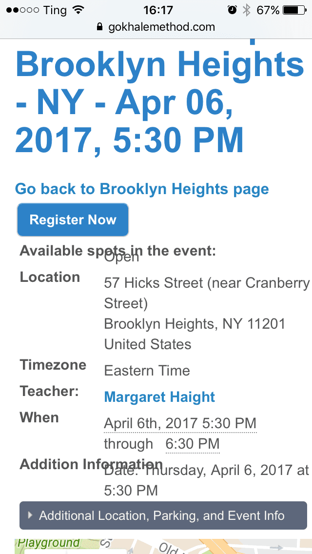
Mobile Class INFO Page: before & After
One major usability problem with the website was the lack of responsive design, preventing a sizable number of mobile users from having a positive experience. The class info pages were particularly problematic, so redesigning this layout with mobile in mind was crucial.
—
Some idiosyncrasies in the original code of the site prevented the map and certain details from being removed or moved freely around the page; in order to present event details above the map in mobile view, there is a “details summary” section at the top of the page that provides some redundant information. We kept this to high-level information that would allow a visitor to quickly see if they can attend this course based on date and location.
Looking back
—
Redesigning the site bit-by-bit was a scrappy process, with ad hoc usability testing, research, and validation. However, I’m confident that we were able to get targeted and useful feedback with the resources available, from using other employees and teachers to impromptu usability tests with students passing through the office. We also used Google Analytics to inform our understanding of what pages were causing problems, usability considerations, and prioritization of redesigns.
This was a project that was more-than-usually focused on functionality and feasibility over visual flair, and was a good exercise in not having ego about making changes to my designs. It was more crucial to keep designs usable and consistent than to develop award-winning UI. In lieu of starting from scratch and doing our own A/B testing on detailed choices like date and time formats, we were able to make informed decisions by comparing standards across related, high-performing websites.
This was a rewarding project to work on because of the freedom I had to take ownership over the design direction and content strategy of the website, and because of my close collaboration with Justin. We were always able to align our priorities because of a shared understanding of the goals and the limitations of what we could accomplish, and an ability to communicate our process to each other and to other stakeholders. Additionally, we believed strongly in the functional benefit of each change we made. Although there were still plenty of items on our to-do list, we saw great improvements to the look, feel, and function of the website throughout my time at the Gokhale Method.


